 So, since I first began hand pulling prints about a year ago, I knew right away that I liked carving the blocks. I also knew I had a lot to figure out about ink and paper, because I wasn't having much luck on that front. I tried dry paper, damp paper, wet paper, thin paper, thick paper, cheap paper, expensive paper, all without producing anything close to a satisfying result. And the same goes for the ink... Speedball water soluable ink out of the tube, and in various stages of thinned out using a variety of methods to get it on the block. Next I moved on to watercolors. I liked them better from the start, but I was still having problems with the pulling prints process.
Now I'm not saying that I haven't made some prints that I like, because I have. But there's always something kind of disappointing about them. The reduction prints seem to start off well, but by the end it seems like a struggle to find the enthusiasm to finish them because there's something I've done that I wish I hadn't. The paper was too wet for one impression and crinkled. The color was wrong on one impression and threw off the whole image. The registration was off. There was a big line outside the printed area where I missed wiping off excess color and didn't notice while printing. The list could go on and on.
But yet I've been compelled to go on. Half way through a print I'm already thinking about what's next and what I'll do differently to make it better. It's like an addiction, and I can't get enough of it, even though the printing process itself had become frustrating.
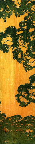
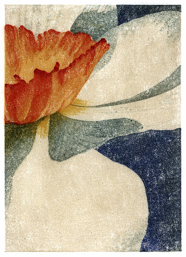
Then I tried using oil paints. My first attempt is to the left. I could get nice, intense, vibrant colors that were transparent, with texture. I could brush on the paint and thin it out and work with the paint on the block. And I could use dry paper!
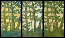
My first reduction print with with the oils is below. The printing process that has been taking a week or more to end up with maybe a couple of decent prints took three days with little to no frustration. And I enjoyed the process. And I have the next one planned.

4 comments:
Neat stuff! Looking forward to more trees from you.
DLO
beautiful work! Have you tried water-based Graphic Chemical Ink for opaque looks and Aquatint ink for more transparent looks? I started out with Speedball and Dick Blick, but there is no comparison. Also try mixing watercolor with nori straight on the block for neat effects. I love your style. It reminds me of the Craftsman period.
Thanks for your comments! Funny you mentioned the Craftsman period - I've always been a fan of the architecture and design and didn't realize it was spilling over into the printmaking.
I've tried about everything I have around the house trying to use up art supplies before investing much money in this, but I've about run out of options. I finally broke down this week and ordered some Akua Kolor inks, recommended by Al (dakokichidekalb). The nori is the next purchase.
Flyers Printing This is very educative content material in addition to very well to get a change. It can be wonderful to determine which some individuals even now discover how to generate a good submit!
Post a Comment