Saturday, December 26, 2009

Christmas Print


So, here it is. My Christmas print. It's a monotype with about 8 impressions on Sekishu with Akua Kolor ink and measures approximately 7.5" x 10". I've found that it is really difficult to get a rich looking black with these inks, hence the multiple impressions. The fact that I don't actually have black ink might also have a little to do with that.

This monotype is from a picture that came from a folder labeled 2002. I think, though, that from my daughter's wispy and barely existent hair, it could have been taken a year or two earlier. I'm guessing Alex and Anna were about 6 and 4.

It reminds me of Christmas past, of the magical mornings where they rushed to the tree to open packages of Legos and Playmobil and dinosuars and Bitty Babies. And it reminds me of all the Christmas Eves I stayed up half the night wrapping presents in two sets of wrapping paper, one from Santa and one from Mom and Dad.

This year, all of the presents were wrapped and under the tree by Christmas Eve, and the toys and surprises, a thing of the past, replaced by clothes and cell phones and amusement park passes. Instead of wrapping, I started this print. I'm calling it "Remember Christmas Magic, Alex & Anna 2002."

Saturday, December 5, 2009

Road Into Town, Continued

So, I put this monotype in DVAC's ARTtoBUY gallery shop. It was kind of a last minute decision because I wasn't sure I wanted to part with it, but since I'm doing the reduction of the same scene I thought I could let go. It's the view when I turn right after pulling out of my street, and it's quite a lovely view headed down the hill that leads into Bellbrook. It always looks different depending on the time of day and the day of the year and the atmosphere. In reality it doesn't actually look all that much like this, but this is what it feels like to me. I guess that's the reason I thought about keeping it. It has personal significance.

Last night was First Friday and I was at The Cannery after leaving DVAC, and I was approached by a group of women who had come from there as well. One of them had just purchased three of my prints, including this one. We talked for a while and she told me about trying to decide which of my prints to buy and of her plans to hang them together. It turns out that she also lives in Bellbrook, and not only does she live in Bellbrook, but she lives almost directly across this road from me.

I love it that without knowing it, she bought a representation of something she sees every day. And that my "Road Into Town" monotype is her road into town.

Saturday, November 7, 2009

The First Demonstration

So, last night I did my first printmaking demonstration at DVAC's opening of ARTtoBUY. First of all, the gallery looked great and I can't believe the transformation of half of it into an art gift shop. Hats off to Patrick Mauk who runs the thing, as he did an incredible job. Secondly, that place was filled! It was three hours of non-stop people and at many times it was difficult to even move about. I can see why they call the event "highly anticipated" on the website. I'm looking forward to my first volunteer day so I can look around and see what items other area artists have to offer. There were some gorgeous looking ceramics pieces and and lots of handmade jewelry.

The reason I didn't get a chance to look around was that I was incredibly busy the entire time I was there. I talked for three straight hours without a break while printing and showing prints I'd done and explaining the process. I think I actually did much more explaining than demonstrating, which was OK, because printing while talking isn't exactly something I'm very good at. I also learned a few lessons about demonstrating, so I think the next time will be easier and I'll be more prepared.

There were a few things I did wrong. First, I was running late, which isn't a big surprise. That left me setting up as people were arriving, and I have to admit I was a little disoriented. I'm so used to my printing set-up at home that it wasn't easy to replicate it in another environment quickly. I hadn't realized that I had become such a creature of habit when it comes time to print. I always know which brush is for the blue and where it will be, so looking for it threw me off a little. Actually the brush/ink thing was a problem that I'll have to give some thought to before I attempt this again. So was sitting down. I've been printing at my kitchen island standing up and for some reason sitting just felt uncomfortable, and my back agrees.

I'm glad I had thought to bring all the sample prints from my demonstration block (above) because I strew them about the table and it looked as if I had just done them, and I could talk about them as I was inking up the block. That block I had made, with several different print combinations, was definitely a good idea. It was easy to explain registration, which a lot of people were curious about, as well as layering colors and having different blocks for each color.

Also, I'm glad I thought to bring what was left of the block from a recent reduction print along with a couple of proofs. It made the proccess easy to explain. In hindsight, though, when someone wanted to purchase one of the proofs which was a different color than the others in the edition, I probably should have let her. She really liked the color. The problem was that I really liked the color to, and I wanted to keep it for myself. I've got to get over that if I'm ever going to make money at this.

I'm a little on the fence as to whether or not it was a good idea to have prints for sale on the table with me. It was probably a good idea, but it kept me from demonstrating because I spent so much time explaining how each was done. Maybe there's a line there that I have to figure out - am I there to show what I do or am I there to talk about it?

And finally, about the talking... It seems like there were mainly two groups of people I talked to. There were people who were not artists or those that used a totally different medium who liked my work and might potentially buy something, and there were those who did similar types of artwork or printmaking who were intensely curious about what I was doing. I enjoyed both groups. There are definitely some people out there who would like to give this a try and I think I could be a rep for Akua Kolor Inks. People who print and have never tried water based inks are amazed by their properties and how they can be used like paint. I have to admit that I had a little difficulty when there were times I had to balance the two groups at once, because I would definitely prefer to talk about ink and paper and barens over trying to sell something.

It was a positive experience. I enjoyed it and the next time I will be more prepared and less apprehensive. As I was on my way home, I started thinking about the demonstration. I was thinking that maybe I'm better suited to showing people how to do this rather than trying to sell what I've done.

Sunday, October 25, 2009

Things That Rank As Cool

So, it was a year ago, First Friday of November 2008, that I went to my very first First Friday. I had known about this First Friday thing since it's inception, where the galleries downtown are open late (and serve drinks), and had thought that it was something I'd like to attend but never really had the opportunity. That night, I just happened to be having beers with a friend from work and I suggested the gallery thing and we did it. And actually, life hasn't been the same since then.

I remember thinking and saying that I wanted to be one of the artists who's work was on display. I thought, for the first time, that I could do this thing. I could be an Artist. And I wanted to do it, and I shot for that goal.

Exactly one year later, I will be.

Dayton Visual Arts Center has this ArtToBuy event, where they turn part of the gallery into a shop during the holiday season. I'm one of the artists and I'll be selling prints. And...I'll be demonstrating that night, demonstrating hand pulled prints Moku Hanga style.

Wow. What a year. And I owe a big thanks to those whose encouragement and support helped me get here.

Getting There

This is the first tree I carved. It was on EasyCut around the end of May in 2008. I remember being really disappointed when I tried to print it. The paper was all wrong. I think I printed on dry pastel paper. And I couldn't get good coverage. I was using Speedball Water Soluble ink applied with a brayer.

I reprinted it this week with Akua Kolor waterbased inks, brushed on, doing multiple impressions on the background and lino block, and printed onto the Japanese handmade paper Kitakata.

What a difference materials make! And a little more experience. I just wish, now that I've started printing from wood, that this was not carved out of that squishy stuff. It is pretty near impossible to get consistent registration with this stuff. It is just too soft. Sure, it is easy to carve, but there's just something about that baren on wood that feels better, and right.

Tuesday, October 6, 2009

Making Some Progress Part II

I was originally going to include these with my previous post, but once I got off the subject with color, I thought it might be better to start fresh. Here is my block after the first and second reduction, as well as the printed results. The print from the first reduction is a little different than the block. I ended up carving away more of the shadow in the road because the shape was looking a little awkward to me.

Now that I see them all printed, I can tell that I've made the some of the same mistakes I've made before. There's not going to be enough variation in the road to make the lightest area pop. I keep going too light with the first and sometimes second layer, over and over again. I'll see how it goes, but I'm kind of thinking I may need to carve another piece to add some color in that area later. I also need to watch my edges. There's a spot in the print I'm scanning right in the middle at the bottom where I've bumped into the edge of the shadow area, and there are a few similar spots on some of the others. I'm hoping that if I am very careful I can even those out in the next impression.

Overall, I'd say things are progressing nicely. I did lose one of my favorites when my baren slipped off the top of the trees, resulting in a couple of little specks right in the middle. I should just stop printing it now, instead of using it as a proof, because each time I see that it is going to remind me not to make that careless mistake again. On the other hand, the more I'm reminded, maybe the less likely I'll be to let it happen again.

Someone told me I'm too critical of myself when I write about artwork I've done. But then again, someone else once told me that when you stop being critical of yourself, you stop trying to do better.

Making Some Progress

So, the reduction print is going fairly well. I started out by making 2 backgrounds on inexpensive paper for proofs and 12 on paper I like. I'm using a mix of paper; creamy colored Kitakata, natural and white Sekishu, and finally 2 on Goyu, a paper I'm trying for the first time.

As usual, each one is different and some I like more than others. Basically, though, they all resemble this one with a light spot on the left and in the road. I'm using Akua Kolor water based inks and thinning them out with their Blending Medium. I started out the same way as with the monotype in my previous post. The first impression consisted of mainly Yellow Ochre brushed thinly over the entire block, wiped away gently in the areas that were to remain light, and then feathered out. The second impression was done with a Raw Umber/Burnt Sienna mixture applied to the darker areas and then feathered into the light area, and the third was some mixture Phalo Blue and who knows what else.

I have a little bit of a color problem. I'm a mixer. I mix in the palette tray I am using and I mix it on the block and sometimes I even mix it on the brush. And then when I print, I mix it up differently for the next one because I just want to see what it would look like if I added just a dab of something else. But it doesn't just apply to printing. It is habitual.

I go to paint a wall in my house and stare at paint chips for hours until I've picked out the perfect color. Once I'm home I do a test strip on the wall and realize it just isn't quite right, and then I start adding things to it. Anything. A little bit of acrylic or gouache from a tube. A little bit of the paint I added stuff to the last time I painted a wall. Then, all of a sudden, it is just the color I was looking for. The only real problem comes when I don't have enough and have to match it, which has happened more than once, but somehow I manage to do it again. Or start over.

Anyway, I had this revelation while I was printing these backgrounds and thinking about my mixing issues and controlling them by trying to make 12 prints that look the same as far as color, because I had tried to keep the first 2 or 3 the same. I remembered a conversation I had with an abstract painter at my office. I was showing him a few of my prints on the internet and describing the process involved. He commented on the fact that he could never plan ahead in the manner that one has to plan ahead to do a print, and that his artwork was more spontaneous. As the conversation progressed, we started talking about color, and he went on and on about color wheels and values and hues and names and knowing what was going to be used going in. He controls the color so the shape can be spontaneous.

After thinking about it for a while, I started thinking there wasn't much difference between my planning ahead and his. I just want to play with the color. I don't want to think about what it's name or number is or keep track of how I made it, I just want to mix it and layer it until it just feels right. I don't even think about it when I'm doing it, I'm just enjoying watching it happen. And maybe that's what printmaking is for me. I control the shape so the color can be spontaneous.

Thursday, October 1, 2009

The Road Into Town Part 2

So, the first step in my reduction print once I had the block carved was going to be printing out some backgrounds. The first two were on cheap scrap paper and the ink coverage was awful, and I was wavering on color. I thought I would use a piece of Sekishu on the third, and I liked the first impression. And the second impression. And so on and so on for about 15 impressions until I had made this. I'm going to call it a monotype study for a reduction print.

It helped me work out a couple of things. I need to reduce the size of the road by about 2/3. I tried it in Photoshop and the whole thing suddenly made more sense. I'm just glad to have discovered the proportional thing before I carved out that big chunk of light. I also need to work out what is going to happen on the lower right portion of the print, but I'm hoping once I reduce the road that may work itself out.

As for color, I'm still wavering so I'll just let that play out on its own.

One other thing I noticed is that I am getting some sharp clean edges printing on this birch plywood. And I like nice edges.

Wednesday, September 30, 2009

The Road Into Town


I don't know how many times over the past eight years that I've lived in my house I've pulled to the end of my street in the morning, stopped to turn right, and then wished I had a camera with me to take a picture of the view heading into downtown Bellbrook. I live at the top of a hill and downtown, with its one intersection, is at the bottom. It's different every morning, depending on the season and the time and the atmosphere. This morning was one of those mornings, but when I got home I pulled out my sketchbook and drew the view.

Suddenly, I have my next reduction print. It was not what I was planning, as I had already drawn out a beach on a piece of linoleum and cut out my paper. But I am feeling this one. The two lightest places, in the sky and in the road. The hills in the distance. The shadow on the road.

So I've decided that this will be the print I blog about start to finish. I've been meaning to do it for a while, but i get so caught up in the process that I don't want to stop to scan things in, or write about them. And I need to come up with a little postcard size visual documentary of what goes into these prints to help people understand as I try and sell them. Step No. 1 is the idea, and here it is.

Step No. 2 is already complete, as tonight I prepared my block. I'll be printing from a piece of birch faced plywood leftover from some panels I made for my built-in fridge. I like this stuff. It is relatively easy to carve and not too grainy, and it doesn't seem to get saturated with ink like my previous wood carving attempts with leftover pine stair treads.

I am definitely getting quicker and more efficient with this first step. Because I already had the 18 sheets of various papers ready to go for the other print I had in mind, I went with the same 7" x 11" size allowing for an inch of border surrounding the print. This is the registration system I've been using lately. I carve a right angle about an inch outside the image area to align the paper on the left and bottom edges.

It is getting to be a little late to move on to the next step tonight, which is likely the reason I am writing about it rather than doing it. I'll be drawing the sketch onto the block and then printing out the lightest ares, the sky and and road. I'm thinking it will take 2-3 impressions to get the gradient going, but that's one of those things that is subject to change once I actually start printing.

I have to add, especially after that previous post about reprinting, that starting something new holds a lot of promise. Who knows. This may be the One. The elusive print with which I am satisfied and happy with upon its completion.

Tuesday, September 29, 2009

Reprinting

So, I am in the process of reprinting some things, for a few different reasons.

I've committed to taking part in Dayton Visual Arts Center's holiday ARTtoBUY event, where they turn part of the gallery into a shop filled with member's artwork for two months. I had to fill out an inventory sheet listing my prints and how many of each print I had available, and I think it is probably a good idea to have that many of each one available.

With the reduction prints, that's an easy number, because once you are done, there are no more prints to be made. The only decision to be made is how many I want to hold back. For many of my early linocuts, however, I only printed one or two that were successful, and several of those were done with oil paint and I don't trust their longevity. Since I switched to the Akua Kolor inks, I've been meaning to redo them when I could find the time.

Also, now since I have an Etsy shop and have had my first few sales, suddenly having a little bit of an inventory seems like a good idea.

The problem I'm having, however, is that I'm finding out that I don't really like to reprint things that I've already printed all that much. It feels a little bit like work, instead of fun. And I keep blowing prints. Since I print multiple, brushed on impressions, I know I am going to lose a couple here and there to bad registration, but I am losing them for careless reasons, like the baren slipping down into carved out areas or off the side. It gets a little frustrating when you are down to the last impression.

I don't know, maybe I'm just not in the right frame of mind. After printing off wood, suddenly linoleum doesn't hold my attention like it once did. It doesn't feel the same. The ink slides off compared to the pressure you exert on wood, and how you can vary that pressure for different effects. And I've noticed that when compared to wood, linoleum has this strange magnetic power to attract every piece of dust or dog hair floating around. Not good during shedding season.

Or maybe it is just that I have too many ideas for new prints, and rehashing the past doesn't seem to be holding my attention or my interest.

Thursday, September 10, 2009

Evolution of a Tree Print

So, this is a story of printmaking gone wrong, or just not tuning out as planned. I always have such high expectations when beginning a print. Thoughts of "Oh, this is the One, this One will be good and I'll be happy" fill my head after the first few impressions until I encounter some kind of obstacle during the process and end up with something different than what I had planned.

The first three images were carved on a leftover piece of pine stair tread I found in my garage. It was my second attempt at carving wood as opposed to linoleum, and I quickly discovered that I preferred printing off the wood. I was very happy with second impression (first image), but impatience got the best of me and I proceeded to carve into the slab of wood when it was still damp. I learned a new lesson. If carving grainy wood, let it dry out before going at it with your carving tools. I lost some huge chunks (by huge I just mean larger than the thin branches) along the grain, perfectly vertical. Suddenly, my efforts turned to making these errors less evident as opposed to focusing on the finished print. I abandoned my original plans and proceeded to create something that is so far removed from what I had envisioned that I even have trouble describing it. It is growing on me, though, as I look at all of them taped to my kitchen wall drying.

Before I made the final reduction (the black in the second image) I decided that now was the time to make the print in my head that used two separate blocks for the sky and tree. I then printed about 24 of the third image, and I knew this print was going to be good. I was sure of it. I made a print on some architectural vellum I had around the house and mounted it to a piece of birch faced plywood leftover from panels I had made a few years ago for my fridge.

I spent three or four days carefully carving it out, growing increasingly anxious to try out the newly carved leaves and branches on my sienna colored background. I knew there was a problem as soon as I started to make the first impression. Apparently the paper had stretched when I glued it to the wood panel and the image I had carefully carved was about 3/4" wider than it should have been. I would write my initial reaction, but I'm fairly sure my mom would give me a hard time about the expletives. Now I have a stack of prints of the third image that I haven't been able to come up with a way to finish. All I have left of the original block is the black shadow area in the second image above, which just looks wrong and out of proportion on this version. I may revisit it at some future point, once I'm sure that I have paper that won't stretch (suggestions?).

This brings me to the final image, which is where I'm at now, after carving out a rectangle to put some color in the background of my newly carved tree. This is going to be the One.

Tuesday, September 8, 2009

Etsy

So, I've finally started an Etsy shop. I've been putting it off for one reason or another for quite a while. Thoughts like "I need to make a chop first" and "I need to make more prints first" and "There is something wrong with every one of these" have continuously been a stumbling block.

Necessity is indeed the mother of invention. I need to invent a way to support my printmaking habit.

Monday, September 7, 2009

2009 DVAC Member Show

This monotype print was recently in the 2009 Dayton Visual Arts Center Member Show. The theme of the show was "Green" and I decided to not take it too literally. That's after I had two other prints matted in the frame that are actually green. There was something about this one that I just really liked, so I went with it.

I liked it until the unimpressed friend I went with said something to the effect of, "You could have done something better." I was already second guessing my decision to submit this bamboo print after my mother had commented, "I thought you were going to use that Mist print."

Oh well. At least someone at DVAC must have thought it was decent. It was on the stand alone wall right when you walk into the gallery with two other pieces of artwork. I probably made a good decision afterall.

Wednesday, July 29, 2009

Multiple Blocks vs. Reduction Printing


I had this idea for a print which was originally was going to be a reduction print, but then I must have been in the mood for carving and decided to make it 3 blocks instead. I think I am beginning to understand more clearly why reduction printing is often referred to as suicide printing.

Doing it this way gives you the opportunity to get it right before you start making prints, which is a big difference. I think I like this one better with 2 blocks instead of three, and I totally changed my color scheme from what I originally had planned.

To see the other versions, check out my Flickr site.

Akua Kolor Kool - Switching To Waterbased Inks

So, a few weeks ago, or maybe it was about a month, I realized that printing with oil paints was not really a good idea. As much as I enjoyed working with them I couldn't get away from the fact that eventually the linseed oil was going to eat through my paper, which is a bit when it comes to making things that people would want to buy.

Enter Akua Kolor water based inks. All I can say is that so far, they have lived up to their claims and recommendations. They are a lot like working with oil paint, being both slow drying and having a similar consistency. And I can print on dry paper.

Akula Kolor is great stuff, and it was well worth the investment. I've been doing a lot of testing, experimenting and playing with them lately, and I only have good things to say.

Well, except that Akula Kolor is kind of hard to clean off kitten paws, although paw prints on chair cushions come off with a little carpet cleaner.

Sunday, June 7, 2009

Fresh Art & Stepping Outside My Comfort Zone

photo courtesy of Randy Jennings

So, when I read about Dayton Visual Art Center's "Fresh Art" the first thing that came to mind was that I was going to do it. The intent of the event which took place Friday night was to create a path of artists plein air painting between art galleries participating in Dayton's monthly First Friday, when they are open until 10pm. I didn't give it much more thought until the week before it was to take place, when the anxiety began to set in.

In case you don't already know, I've been a commercial artist (architectural illustrator/graphic designer) for a couple of decades. Inspired by a new found love of printmaking, I decided my New Year's resolution would be to drop "commercial" and try and call myself an artist. I've been taking part in art opportunities as they arise and so far it has been going well.

I knew the urban plein air thing would be cake, as far as the actual drawing was concerned, because I have been drawing buildings to put a roof over my head for a long time. What I didn't think about, however, was that I would be doing it in front of people, and that I would have to talk to them, and that they would see something before it was finished. When that hit me, my first thought was to pray for rain. Being an introvert who never thinks anything she does is finished or good enough, I was going to be way outside my comfort zone with this thing.

But once I got set up and found my view, everything else just came naturally. Talking to people and being engaging while I was working on my artwork was no problem, and it was actually fun and interesting. Stepping outside you comfort zone can be a good thing.

Now all I have to do is change and correct a few things on this so it will be finished. Or almost finished.

Wednesday, May 20, 2009

Juried Show Number Two

So, I just received notification that this 8" x 10" soft pastel on panel was selected for "The View 2009 - A Juried Landscape Competition" which is open to all Ohio artists. 271 pieces submitted, 58 selected.

This thing has been everywhere in my house over the past couple of years. It's been stacked in a pile of pastels on the top shelf of the closet in my laundry room, leaned up against the wall behind a dresser, placed on several different bookcases, and right now it is on my kitchen window sill. I'm not all that sure that I even like to look at it anymore. And now I have to look at it a lot and figure out just what kind of frame it should go in.

I was a little surprised that of the three I submitted, this was selected, because I thought it was the weakest. Guess that shows what I know! Now I am two for two with the juried art shows, though, and I like that.

Monday, March 30, 2009

Last Year's Grasses, Finished

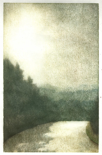
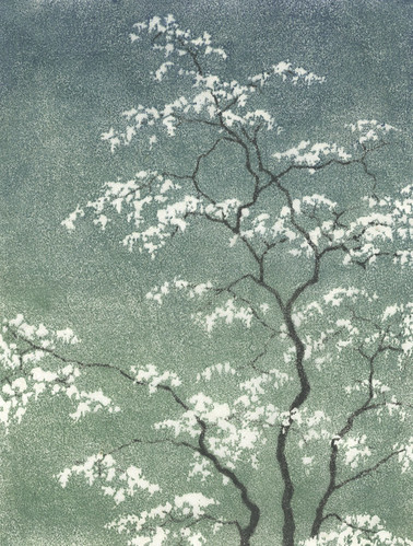
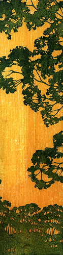
So, here's the finished print from my last post. I'm feeling so-so about it. I discovered and worked out some things with color and value which will help me out in the future, and then proceeded to totally overuse them. I also had some vision problems about half way through this one and once I missed a bunch of stray orange marks outside the edges and inside some of the prints, I kind of lost interest and just wanted to get it over with so I could move on with my life.

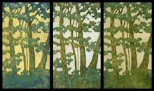
This is #5, my fifth reduction print. The 
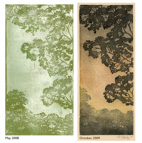
first one was back in August, and I ended up disappointed with it after the amount of time I had put in. I tried again at the end of January and that print ended up in a juried show, giving me some encouragement to keep going with it, even though I was disappointed with it as well. I'm starting to wonder when I'm going to look at a finished print and say "I am happy with this." But yet I am totally compelled to keep going with it.

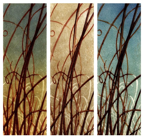
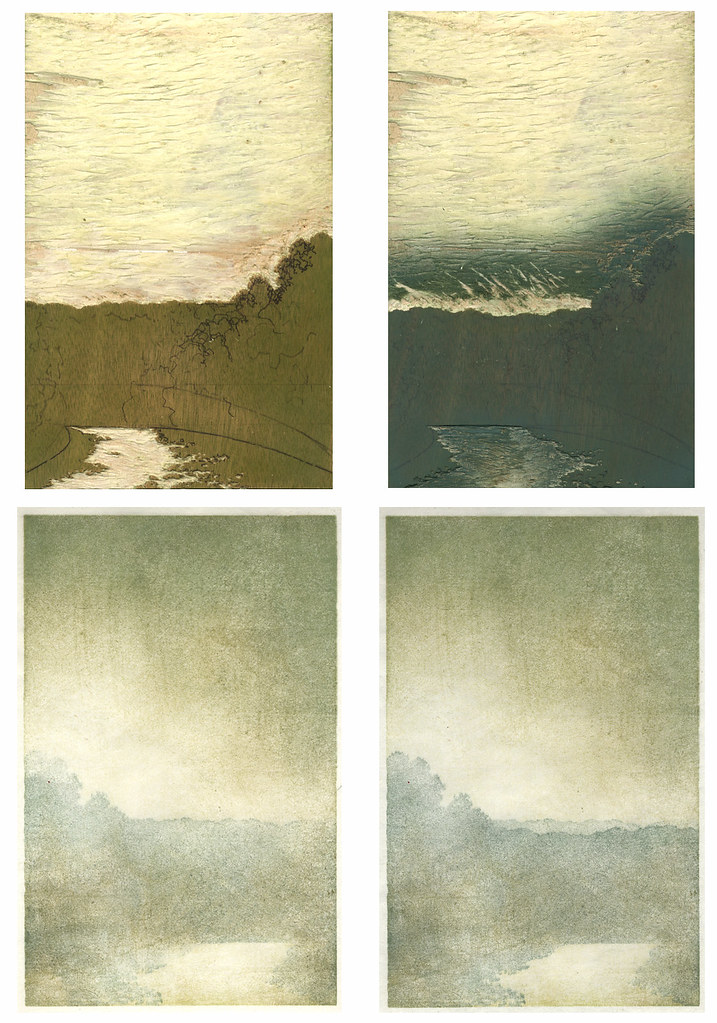
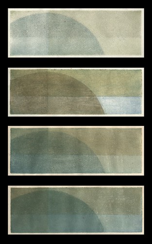
I am satisfied with the color on these. There are about twelve-fourteen of them, each on a different background. Using different backgrounds helped me come to the realization that I think I prefer that things have either a background of yellow ochre or one of the umbers. And I realized that's where it gets a little tricky, or easier, because once you have a background every color choice you make is dependent on what's below. You have to put some thought into it if you want to end up with mud, but you can acieve some great intensity if you do it right. I had been trying to make colors darker by making them darker until I had a totally "DUH" moment. This is transparent oil paint in thin layers. If I want to make red darker, don't add black to the red, print a thin layer of viridian. Rich darkness achieved, finally!

I also discovered that a very integral part of this whole printing process is being able to see what you are doing. Into my second impression of orange on the grass, after moving lights around and adding lights, I suddenly realized that the problems I was having with lighting were not due to the lighting. I couldn't see very well! A cheap pair of reading glasses confirmed it. My prescription had changed and I didn't have a clue that it had happened. Carving was much easier that night, but I didn't bother to put them on when I was printing and looking at my prints.

Big mistake. I missed stray printing marks all over the place, stray printing marks that I didn't even notice until a day later, when I took out my contacts and put on my glasses because my eyes were still bothering me when I worked on the computer. The thought had briefly crossed my mind that the problem could be the contacts, and not my eyes, but I had dismissed it. Once I took them out and put on my glasses I immediately remembered a comment that my 13-year-old son had made a few days earlier, about feeling dizzy. Even though our cases are completely different and his is marked, he had somehow switched them. I'm still seeing the eye doctor this week, because the reading glasses did make a difference, and I am also keeping my contacts in a different bathroom from here on out.

Now the question is what to do with all of these prints, that look ok for the most part, but have these little errors all over the place, especially outside the edges. Maybe I'm just too picky, and once I finally open an Etsy store people won't care about the little mistakes. Or maybe I'll just sell them all as proofs, or mat them to hide the edges, or, leave them stacked in that growing pile of artwork.

This whole thing is such a learning process, and with each print I've worked out problems I had in the previous one. And I'm totally in love with the process. But sooner or later I'm going to have to try and generate a little income from it, so it can start paying for itself.

Sunday, March 22, 2009

Last Night's Prints, This Morning


So, I've noticed that there are quite a few printmakers who post pictures of their prints laid out drying. I get it now. It's kind of satisfying to see them all lined up, after the care and attention that's been given to each one. These have been reduced twice and have had around 6-10 impressions apiece, and this is just the background.

I've also noticed that with most of the other reduction prints I've seen spread out like this, the prints are all the same. I think picking out a color combination and sticking with it for the whole edition is supposed to be part of the whole goal of this printmaking process. I don't know, but I don't think that's for me. I like random. I think when I look at mine, I like them all to be different, each special and unique in its own way.

The next step in this one will be a lot of carving, before I get back to printing again. And, if this next printing phase goes like my previous tries, I'll lose about five of these twelve little colorful gems to careless errors or poor color choices. But at least now I'll have this image to remember them by, and the promise they all once held.

Thursday, March 19, 2009

Printing With Oil Paints 1.0

So, since I first began hand pulling prints about a year ago, I knew right away that I liked carving the blocks. I also knew I had a lot to figure out about ink and paper, because I wasn't having much luck on that front. I tried dry paper, damp paper, wet paper, thin paper, thick paper, cheap paper, expensive paper, all without producing anything close to a satisfying result. And the same goes for the ink... Speedball water soluable ink out of the tube, and in various stages of thinned out using a variety of methods to get it on the block. Next I moved on to watercolors. I liked them better from the start, but I was still having problems with the pulling prints process.

Now I'm not saying that I haven't made some prints that I like, because I have. But there's always something kind of disappointing about them. The reduction prints seem to start off well, but by the end it seems like a struggle to find the enthusiasm to finish them because there's something I've done that I wish I hadn't. The paper was too wet for one impression and crinkled. The color was wrong on one impression and threw off the whole image. The registration was off. There was a big line outside the printed area where I missed wiping off excess color and didn't notice while printing. The list could go on and on.

But yet I've been compelled to go on. Half way through a print I'm already thinking about what's next and what I'll do differently to make it better. It's like an addiction, and I can't get enough of it, even though the printing process itself had become frustrating.

Then I tried using oil paints. My first attempt is to the left. I could get nice, intense, vibrant colors that were transparent, with texture. I could brush on the paint and thin it out and work with the paint on the block. And I could use dry paper!

My first reduction print with with the oils is below. The printing process that has been taking a week or more to end up with maybe a couple of decent prints took three days with little to no frustration. And I enjoyed the process. And I have the next one planned.

Box of Trouble

So, last week I opened this box that has been sitting in my laundry room for the past five months. I resisted the temptation to take a look even though I knew what was inside - my mother's oil paints. Opening it was like opening the kind of gift that keeps on giving, the kind that you know will bring you hour after hour of enjoyment.

And what eye candy. Partially used tubes of paint in a vast color range, from different manufacturers, of different ages. The smell of linseed oil and turpentine. My senses went into automatic overload as I was overcome with the urge to see how they felt. I had never tried painting with oils and couldn't wait to give it a go.

That first night, I cranked out a little 8" x 8" loose looking landscape, and I liked it. Quick, expressive and easy.


So the next night, I thought I would retry my most recent failed reduction print, one which will likely never get posted here or made public on flickr. That week of my life was wasted and I'll never get it back. But I digress. The first night went well, and I enjoyed it. I was painting from a picture I took last year. The second night I was anxious to get started, but then, suddenly after an hour or so, it got boring. Yeah, I can look at a picture and paint it. It wasn't doing much for me at all.

I realized painting is not quite my thing. At least not this kind of painting. If I was going to do something plein air I would definitely go with these, but not for any kind of artwork that you work on for a while. I just don't feel any connection.

The next night I printed with them. Joy.

Sunday, March 1, 2009

19th Annual Dayton Area Works On Paper

So today I went to the opening reception of the 19th Annual Dayton Area Works on Paper at the Rosewood Art Gallery. It was the first time I've ever had anything hanging at an art show, and the first time I've ever submitted anything to a juried show. I submitted two prints and the one pictured (or one that kind of resembles it) was accepted.

It's a good show. Lots of variety and plenty of strong artwork, a lot of it by well known Dayton artists. Around 250 pieces submitted with 55 being selected.

I'm not sure why mine was there. I guess it looked OK, but I'm kind of surprised it was chosen. Or maybe it's that I'm not sure why I chose it, because there are better ones in this edition. And I hate the way I matted it. It has nice clean edges and I cropped them because I don't like the leaf on the bottom left. I have to keep reminding myself that this stuff takes a lot of time, and after all, it's carved, and getting a gradient using layers of carving not exactly an easy process, so maybe I earned some points for that.

All in all, it was kind of anticlimactic. It was nice to see it there, but I didn't really like seeing it that much. A little uncomfortable. Maybe this stuff is better left in the growing pile of unfinished artwork until I make something I look at and think, "Wow. I'm happy with that."

Artist Site

So, a couple of months ago I bought back my starkeyart.com domain and I've just put up a new site over the weekend. It was kind of challenging, because I didn't want it to be about design, just about artwork I've done, so I tried to keep it simple. Check it out if you get a chance.