Wednesday, July 29, 2009

Multiple Blocks vs. Reduction Printing


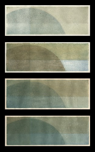
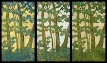
I had this idea for a print which was originally was going to be a reduction print, but then I must have been in the mood for carving and decided to make it 3 blocks instead. I think I am beginning to understand more clearly why reduction printing is often referred to as suicide printing.

Doing it this way gives you the opportunity to get it right before you start making prints, which is a big difference. I think I like this one better with 2 blocks instead of three, and I totally changed my color scheme from what I originally had planned.

To see the other versions, check out my Flickr site.

Akua Kolor Kool - Switching To Waterbased Inks

So, a few weeks ago, or maybe it was about a month, I realized that printing with oil paints was not really a good idea. As much as I enjoyed working with them I couldn't get away from the fact that eventually the linseed oil was going to eat through my paper, which is a bit when it comes to making things that people would want to buy.

Enter Akua Kolor water based inks. All I can say is that so far, they have lived up to their claims and recommendations. They are a lot like working with oil paint, being both slow drying and having a similar consistency. And I can print on dry paper.

Akula Kolor is great stuff, and it was well worth the investment. I've been doing a lot of testing, experimenting and playing with them lately, and I only have good things to say.

Well, except that Akula Kolor is kind of hard to clean off kitten paws, although paw prints on chair cushions come off with a little carpet cleaner.

Sunday, June 7, 2009

Fresh Art & Stepping Outside My Comfort Zone

photo courtesy of Randy Jennings

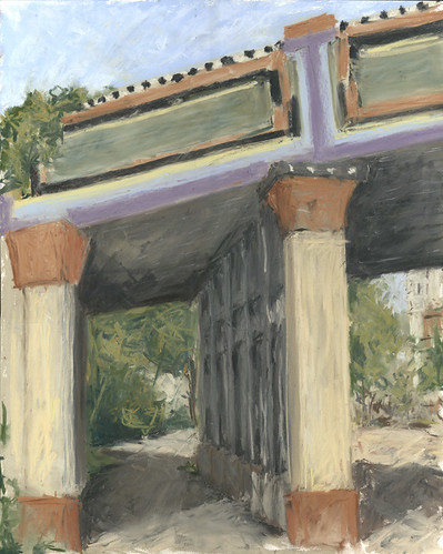
So, when I read about Dayton Visual Art Center's "Fresh Art" the first thing that came to mind was that I was going to do it. The intent of the event which took place Friday night was to create a path of artists plein air painting between art galleries participating in Dayton's monthly First Friday, when they are open until 10pm. I didn't give it much more thought until the week before it was to take place, when the anxiety began to set in.

In case you don't already know, I've been a commercial artist (architectural illustrator/graphic designer) for a couple of decades. Inspired by a new found love of printmaking, I decided my New Year's resolution would be to drop "commercial" and try and call myself an artist. I've been taking part in art opportunities as they arise and so far it has been going well.

I knew the urban plein air thing would be cake, as far as the actual drawing was concerned, because I have been drawing buildings to put a roof over my head for a long time. What I didn't think about, however, was that I would be doing it in front of people, and that I would have to talk to them, and that they would see something before it was finished. When that hit me, my first thought was to pray for rain. Being an introvert who never thinks anything she does is finished or good enough, I was going to be way outside my comfort zone with this thing.

But once I got set up and found my view, everything else just came naturally. Talking to people and being engaging while I was working on my artwork was no problem, and it was actually fun and interesting. Stepping outside you comfort zone can be a good thing.

Now all I have to do is change and correct a few things on this so it will be finished. Or almost finished.

Wednesday, May 20, 2009

Juried Show Number Two

So, I just received notification that this 8" x 10" soft pastel on panel was selected for "The View 2009 - A Juried Landscape Competition" which is open to all Ohio artists. 271 pieces submitted, 58 selected.

This thing has been everywhere in my house over the past couple of years. It's been stacked in a pile of pastels on the top shelf of the closet in my laundry room, leaned up against the wall behind a dresser, placed on several different bookcases, and right now it is on my kitchen window sill. I'm not all that sure that I even like to look at it anymore. And now I have to look at it a lot and figure out just what kind of frame it should go in.

I was a little surprised that of the three I submitted, this was selected, because I thought it was the weakest. Guess that shows what I know! Now I am two for two with the juried art shows, though, and I like that.

Monday, March 30, 2009

Last Year's Grasses, Finished

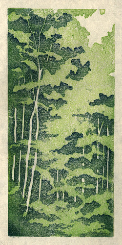
So, here's the finished print from my last post. I'm feeling so-so about it. I discovered and worked out some things with color and value which will help me out in the future, and then proceeded to totally overuse them. I also had some vision problems about half way through this one and once I missed a bunch of stray orange marks outside the edges and inside some of the prints, I kind of lost interest and just wanted to get it over with so I could move on with my life.

This is #5, my fifth reduction print. The first one was back in August, and I ended up disappointed with it after the amount of time I had put in. I tried again at the end of January and that print ended up in a juried show, giving me some encouragement to keep going with it, even though I was disappointed with it as well. I'm starting to wonder when I'm going to look at a finished print and say "I am happy with this." But yet I am totally compelled to keep going with it.

I am satisfied with the color on these. There are about twelve-fourteen of them, each on a different background. Using different backgrounds helped me come to the realization that I think I prefer that things have either a background of yellow ochre or one of the umbers. And I realized that's where it gets a little tricky, or easier, because once you have a background every color choice you make is dependent on what's below. You have to put some thought into it if you want to end up with mud, but you can acieve some great intensity if you do it right. I had been trying to make colors darker by making them darker until I had a totally "DUH" moment. This is transparent oil paint in thin layers. If I want to make red darker, don't add black to the red, print a thin layer of viridian. Rich darkness achieved, finally!

I also discovered that a very integral part of this whole printing process is being able to see what you are doing. Into my second impression of orange on the grass, after moving lights around and adding lights, I suddenly realized that the problems I was having with lighting were not due to the lighting. I couldn't see very well! A cheap pair of reading glasses confirmed it. My prescription had changed and I didn't have a clue that it had happened. Carving was much easier that night, but I didn't bother to put them on when I was printing and looking at my prints.

Big mistake. I missed stray printing marks all over the place, stray printing marks that I didn't even notice until a day later, when I took out my contacts and put on my glasses because my eyes were still bothering me when I worked on the computer. The thought had briefly crossed my mind that the problem could be the contacts, and not my eyes, but I had dismissed it. Once I took them out and put on my glasses I immediately remembered a comment that my 13-year-old son had made a few days earlier, about feeling dizzy. Even though our cases are completely different and his is marked, he had somehow switched them. I'm still seeing the eye doctor this week, because the reading glasses did make a difference, and I am also keeping my contacts in a different bathroom from here on out.

Now the question is what to do with all of these prints, that look ok for the most part, but have these little errors all over the place, especially outside the edges. Maybe I'm just too picky, and once I finally open an Etsy store people won't care about the little mistakes. Or maybe I'll just sell them all as proofs, or mat them to hide the edges, or, leave them stacked in that growing pile of artwork.

This whole thing is such a learning process, and with each print I've worked out problems I had in the previous one. And I'm totally in love with the process. But sooner or later I'm going to have to try and generate a little income from it, so it can start paying for itself.
Sunday, March 22, 2009

Last Night's Prints, This Morning


So, I've noticed that there are quite a few printmakers who post pictures of their prints laid out drying. I get it now. It's kind of satisfying to see them all lined up, after the care and attention that's been given to each one. These have been reduced twice and have had around 6-10 impressions apiece, and this is just the background.

I've also noticed that with most of the other reduction prints I've seen spread out like this, the prints are all the same. I think picking out a color combination and sticking with it for the whole edition is supposed to be part of the whole goal of this printmaking process. I don't know, but I don't think that's for me. I like random. I think when I look at mine, I like them all to be different, each special and unique in its own way.

The next step in this one will be a lot of carving, before I get back to printing again. And, if this next printing phase goes like my previous tries, I'll lose about five of these twelve little colorful gems to careless errors or poor color choices. But at least now I'll have this image to remember them by, and the promise they all once held.

Thursday, March 19, 2009

Printing With Oil Paints 1.0

So, since I first began hand pulling prints about a year ago, I knew right away that I liked carving the blocks. I also knew I had a lot to figure out about ink and paper, because I wasn't having much luck on that front. I tried dry paper, damp paper, wet paper, thin paper, thick paper, cheap paper, expensive paper, all without producing anything close to a satisfying result. And the same goes for the ink... Speedball water soluable ink out of the tube, and in various stages of thinned out using a variety of methods to get it on the block. Next I moved on to watercolors. I liked them better from the start, but I was still having problems with the pulling prints process.

Now I'm not saying that I haven't made some prints that I like, because I have. But there's always something kind of disappointing about them. The reduction prints seem to start off well, but by the end it seems like a struggle to find the enthusiasm to finish them because there's something I've done that I wish I hadn't. The paper was too wet for one impression and crinkled. The color was wrong on one impression and threw off the whole image. The registration was off. There was a big line outside the printed area where I missed wiping off excess color and didn't notice while printing. The list could go on and on.

But yet I've been compelled to go on. Half way through a print I'm already thinking about what's next and what I'll do differently to make it better. It's like an addiction, and I can't get enough of it, even though the printing process itself had become frustrating.

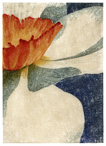
Then I tried using oil paints. My first attempt is to the left. I could get nice, intense, vibrant colors that were transparent, with texture. I could brush on the paint and thin it out and work with the paint on the block. And I could use dry paper!

My first reduction print with with the oils is below. The printing process that has been taking a week or more to end up with maybe a couple of decent prints took three days with little to no frustration. And I enjoyed the process. And I have the next one planned.