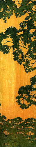
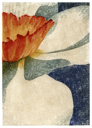
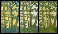
So, here's the finished print from my last post. I'm feeling so-so about it. I discovered and worked out some things with color and value which will help me out in the future, and then proceeded to totally overuse them. I also had some vision problems about half way through this one and once I missed a bunch of stray orange marks outside the edges and inside some of the prints, I kind of lost interest and just wanted to get it over with so I could move on with my life.
This is #5, my fifth reduction print. The first one was back in August, and I ended up disappointed with it after the amount of time I had put in. I tried again at the end of January and that print ended up in a juried show, giving me some encouragement to keep going with it, even though I was disappointed with it as well. I'm starting to wonder when I'm going to look at a finished print and say "I am happy with this." But yet I am totally compelled to keep going with it.
 I am satisfied with the color on these. There are about twelve-fourteen of them, each on a different background. Using different backgrounds helped me come to the realization that I think I prefer that things have either a background of yellow ochre or one of the umbers. And I realized that's where it gets a little tricky, or easier, because once you have a background every color choice you make is dependent on what's below. You have to put some thought into it if you want to end up with mud, but you can acieve some great intensity if you do it right. I had been trying to make colors darker by making them darker until I had a totally "DUH" moment. This is transparent oil paint in thin layers. If I want to make red darker, don't add black to the red, print a thin layer of viridian. Rich darkness achieved, finally!
I also discovered that a very integral part of this whole printing process is being able to see what you are doing. Into my second impression of orange on the grass, after moving lights around and adding lights, I suddenly realized that the problems I was having with lighting were not due to the lighting. I couldn't see very well! A cheap pair of reading glasses confirmed it. My prescription had changed and I didn't have a clue that it had happened. Carving was much easier that night, but I didn't bother to put them on when I was printing and looking at my prints.
Big mistake. I missed stray printing marks all over the place, stray printing marks that I didn't even notice until a day later, when I took out my contacts and put on my glasses because my eyes were still bothering me when I worked on the computer. The thought had briefly crossed my mind that the problem could be the contacts, and not my eyes, but I had dismissed it. Once I took them out and put on my glasses I immediately remembered a comment that my 13-year-old son had made a few days earlier, about feeling dizzy. Even though our cases are completely different and his is marked, he had somehow switched them. I'm still seeing the eye doctor this week, because the reading glasses did make a difference, and I am also keeping my contacts in a different bathroom from here on out.
Now the question is what to do with all of these prints, that look ok for the most part, but have these little errors all over the place, especially outside the edges. Maybe I'm just too picky, and once I finally open an Etsy store people won't care about the little mistakes. Or maybe I'll just sell them all as proofs, or mat them to hide the edges, or, leave them stacked in that growing pile of artwork.
This whole thing is such a learning process, and with each print I've worked out problems I had in the previous one. And I'm totally in love with the process. But sooner or later I'm going to have to try and generate a little income from it, so it can start paying for itself.