Showing posts with label printmaking. Show all posts

Thursday, August 12, 2010

Waterless Litho Luv, AKA, Somebody Hide the Calligraphy Pens Please

So, a few months ago I had about an hour to pop into a workshop at the Dayton Printmakers Co-Op by Sinclair printmaking professor Kevin Harris for a quick lesson on waterless lithography. For those unfamiliar with the process, it goes something like this... you draw on a grained aluminum litho plate, cover the drawing with a thin layer of silicone, wash off the drawing and voila, you are left with a plate which repels rubber based ink anywhere there is silicone. You can also use the process by transferring a Xerox copy to the plate with lacquer thinner or acetate and then going through the same steps. Sounds pretty simple, eh?

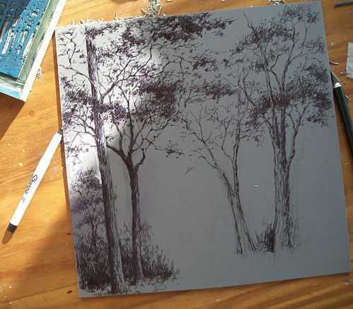
It's not that complicated of a process, but of course there are some variables and things that can go wrong and things you can spend a lot of time correcting. Otherwise it would be something different than printmaking. You are supposed to be able to draw with any water based media so I tried about everything I had around the house, from watercolor pencils to some mixture of Akua Kolor ink and modifiers of who knows what kind, to sharpies and gel pens, which are also supposed to work. I spent a lot of time drawing. Note to self: Always do a small test before investing a lot of time drawing! Needless to say, I wasted a few plates and drawings and hours, but I did get to enjoy the drawing part of it. And I got smart and started scanning in my drawings so in case I ruin the one on the plate I can still try the Xerox method, even though I'm resistant to using anything that is a "reproduction." I think I'm afraid that once I go down that road I'll start going through the thousands of photographs that live on this machine and start trying to print those instead of coming up with new things.

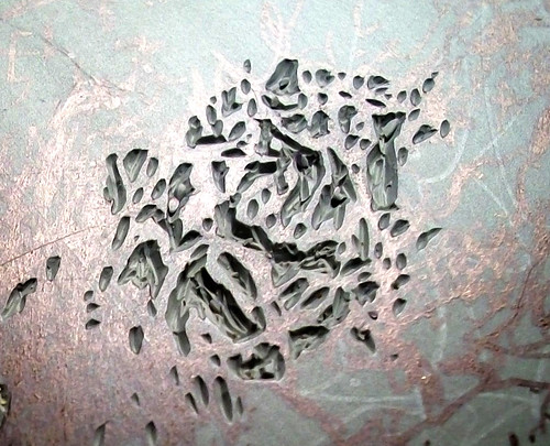
Anyway, I discovered that there's something about the way ink flows onto these aluminum plates from a calligraphy pen, those kind you dip into the ink, that's a little bit magical. There's something about the smoothness of it and the way it clings to the surface that's graceful and sexy and it's hard to resist. And it's perfect for drawing tree limbs. There's also a randomness to the prints that I really like. I keep ending up losing some of the fine detail in the silicone process, as this is one of the variables that it's difficult to get just right. You get it on a little to thick or too thin and then you can't wash away the drawing or you wash off too much. But in a way I like that. It gives a neat and tidy drawing a little edginess, or something like that, and the random stuff can happen with in the inking is also pretty appealing to me.

And I get to play with ink. I've been inking them up with a rubber based black VanSon ink and then applying Akua Kolor over the plate. It's a trial and error process, as it's difficult to get the Akua Kolor just the right consistency to adhere to the silicone...it naturally wants to bead up. Thin layers brushed on and feathered out very gently seem to work best. I can't get any of the softness I like about my woodcuts with the process, and believe me I've tried and failed, but there's something stark and graphic about the end product that I like. And wow, do I enjoy the drawing part.

Tuesday, August 10, 2010

Art On The Commons, The Morning After

So, Sunday I experienced my first art fair, Art On the Commons in Kettering, Ohio. It's a pretty big deal around here with about 100 artists juried in, 35 of them local, including me. I'm still thinking about it and trying to figure out what I did wrong and what I did right, and if it was worth the time and effort. Today I'm thinking it was definitely worth it now that I've cleaned up the aftermath of my whirlwind preparations pictured above.

One of my biggest mistakes is evident in that photo...the unfinished and experimental prints. A couple of weeks before something like this is not the time to be trying new things and making new prints, but I just couldn't help myself. When I should have been packaging up prints or reprinting things that I know sell well I was trying out some crazy hand inked collagraphs made from plants, carving and printing a big, yet-to-be-completed reduction print and trying to crank out some monotypes using pieces of lino blocks from previous prints. And there were the three reduction prints that still needed the last impression on over half the prints. I was a printmaking machine and I couldn't stop. I guess, in retrospect, that I didn't want to stop. After all, printing is great and I had a good excuse to be doing it. But the result of my actions was not so fun... two solid days and nights of cutting foamcore and mats and framing, printing up business cards and other collateral at the last minute and almost slicing my finger to the point of needing stitches, and packing my car up like a madman while trying not to bleed on any artwork.

I guess I'm a little regretful that I didn't make the most of the time I had to prepare, which left me a little loopy and not at my sharpest the day of the event, but on the other hand I got to spend the better part of my free time the past few weeks making prints. Or at least trying to. What could be better than that?

One of the craziest things I did during the preparations, though, had to be getting out oil paints and spending half a day painting over a canvas I started 10 years ago, especially considering the fact that I never paint. That is almost tied with the twenty or so hours I spent drawing on two litho plates when I don't know how to do lithography, just because once I started drawing with those litho crayons I really liked it and couldn't stop. I did get one good print from one of them before I ruined the plate, but I guess I can't consider it a good print because it's on newsprint. It was a damn fine litho crayon drawing, though.

Either I have ADD or given an excuse to make some art, that's all I'm going to be doing with every second of time I can find. Anyway, back to the point of the post, the art fair. It went well. I didn't make a huge profit but I slightly doubled the money I had into it, so I can't complain even though I had higher expectations. My expectations were so high, in fact, that I won't have to package up or mat or frame anything for a while, and I can focus on just making art. I've got the business part out of the way through the holidays and I won't have to spend any time or money getting ready for ARTtoBUY at DVAC this year, and I probably have enough packaged prints to start trying to spread them around the Miami Valley...and beyond.

The highlight of the whole thing, though, had to be the people. I just wish I hadn't been so tired and had been more engaging, and I wish I would have remembered to bargain with people who came back for a second look. But it was great to see people I hadn't seen for a while who came to see me because they saw my name in the paper. Also great were the moments when people recognized my work from DVAC and the Cannery, and even better were the three times when absolute strangers came up to me and told me they read this blog and talked about specific posts. How cool is that?

Looking back and writing about it and thinking about it, I would definitely do it all again, in a heartbeat. There's no way I would trade in a few days of crazy-busy for the joy of spending July 2010 making prints and trying new things and meeting people interested in how I print and meeting people who recognize my artwork. I guess after all the years I've spent having my hard work attributed to "artist rendering" that I have to say tonight that it's feeling pretty good to be the artist Andrea Starkey.

Wednesday, August 4, 2010

Celebrating Two Years of Reduction Printmaking, and Smiling

So, exactly two years ago today I started my first reduction print, these hosta leaves. I know it was exactly two years ago today because it was my birthday and I woke up early on a Sunday morning while everyone else in the house slept in and decided I was going to give reduction printmaking a try. I remembered how unhappy I was with the results as I read this blog post where I refer to it as a "FAIL" and how I put all printmaking aside and waited four months before attempting another.

As I was reading all I could do was smile. It isn't a fail, and for a first attempt and considering the materials I used and the fact that I printed this with my hand and the bottom of a glass and had no idea what a baren was, it's not half bad. I think my expectations were just a little high at the time. I look at the details now and I can see the care that went into every cut and I can remember that initial excitement of what it was like to see what each successive layer would look like printed. Even though this was the print that I wanted to cut up into pieces once it was finished and the print that caused me to put printmaking on hold for months, it was also the print that made me fall in love with the process.

I woke up yesterday morning and I discovered that I had sold my first Hosta print, almost exactly two years to the day that I started it. The best part of selling one of these isn't that I sold one or that someone else liked it enough to buy one. The best part is that it made me take a good look at the print again, and at the past couple of years, and realize that something as simple as the joy I get from carving and inking some lines and and transferring them to paper makes me a lucky person.

Well that and the fact that it did help pay for my birthday dinner.

Saturday, February 13, 2010

Road Into Town, Continued Once Again


So, I put the final layer of ink down on my Road Into Town print a couple of Sunday nights ago, giving it just enough time to dry before throwing it into a frame to submit to Dayton Area Works on Paper the following Monday. I've blogged about the making of this one here, here, here, here and here, but I just wasn't able to bring myself to print the final reduction until faced with a deadline. And I wasn't thrilled with the end result, although it did look good matted and framed.

Apparently good enough to get into the show. The Road Into Town is completed at last, or at least version Number 1.

Tuesday, January 5, 2010

New Year, New Print & Out of the Mouth of Babes Comes Wisdom?

So there it was, January 2 of the New Year, and I had just finished a reduction print and was thinking about clearing up my printmaking mess and putting away the Christmas decorations. Instead I kept staring at the two 12" x 12" linoleum blocks my 14 year-old son had picked out for me as a Christmas present, and he was putting the pressure on.

"Those are big, you need to make something cool!" and "What are you going to print from those?" were just a few of the comments I was getting on a daily basis. He was so proud of himself for picking out a gift he knew I would enjoy that he was beside himself with anticipation of what would come from it.

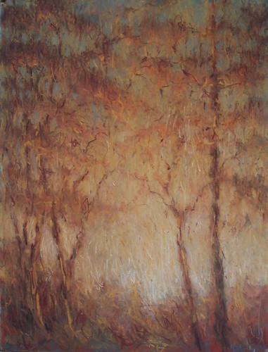
I've been thinking for a while that I wanted to a reduction print based on this pastel I did earlier this year, with a greenish sky and orange trees, and I decided now was the time. I proceeded to draw out something similar in Sharpie on one of my new Christmas blocks. While I was drawing and looking at the pastel it made me think about what direction I wanted to go. For some reason, I am compelled by the idea of having prints look more like drawings, of having more freedom and expressiveness line. I don't want them to look graphic or like a copy of a photograph, I want them to look in some way representational of what I see, and have some feeling and movement to them, and maybe impressionistic is the word to describe it.

And then I start to think, why am I not just making pastels? This one is pretty decent and it's a hell of a lot easier than printmaking. But, as anyone who prints will understand, there is nothing quite as rewarding as pulling that paper off the block and seeing what you have created even though it does take a lot of planning. Is it possible to make something planned look expressive? Or even more important, is it possible to create and carve something expressively that has to have planning to it? The planning kind of takes some of the freedom out of it for me. So that, I think, is one of my goals this year, to find a combination of spontaneity and planning that is evident in the finished print.

So, as I began to draw out the future print on my fresh piece of linoleum, I had a lot of things running through my head. I was thinking about how it would work out, and how I would carve it and how I would refine the lines before I carved. Then my son came into the room. He said something like "Too bad you can't make a print look like the way you draw." Hmmm.

I've never tried to print the way I draw and sketch. I was getting kind of close to it with that sycamore reduction print I just finished, but that was planned. I've always drawn, and then refined my lines to what I think a print should look like before I started carving. Maybe the key to finding the balance between what is planned and what is spontaneous for me lies somewhere in following the lines that come naturally to me when I draw.

I have no idea how this will go as I follow these Sharpie lines, but it's worth a try. Game on, son. I'll take that as a challenge.

Saturday, December 5, 2009

Road Into Town, Continued

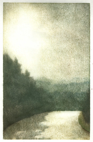
So, I put this monotype in DVAC's ARTtoBUY gallery shop. It was kind of a last minute decision because I wasn't sure I wanted to part with it, but since I'm doing the reduction of the same scene I thought I could let go. It's the view when I turn right after pulling out of my street, and it's quite a lovely view headed down the hill that leads into Bellbrook. It always looks different depending on the time of day and the day of the year and the atmosphere. In reality it doesn't actually look all that much like this, but this is what it feels like to me. I guess that's the reason I thought about keeping it. It has personal significance.

Last night was First Friday and I was at The Cannery after leaving DVAC, and I was approached by a group of women who had come from there as well. One of them had just purchased three of my prints, including this one. We talked for a while and she told me about trying to decide which of my prints to buy and of her plans to hang them together. It turns out that she also lives in Bellbrook, and not only does she live in Bellbrook, but she lives almost directly across this road from me.

I love it that without knowing it, she bought a representation of something she sees every day. And that my "Road Into Town" monotype is her road into town.

Saturday, November 7, 2009

The First Demonstration

So, last night I did my first printmaking demonstration at DVAC's opening of ARTtoBUY. First of all, the gallery looked great and I can't believe the transformation of half of it into an art gift shop. Hats off to Patrick Mauk who runs the thing, as he did an incredible job. Secondly, that place was filled! It was three hours of non-stop people and at many times it was difficult to even move about. I can see why they call the event "highly anticipated" on the website. I'm looking forward to my first volunteer day so I can look around and see what items other area artists have to offer. There were some gorgeous looking ceramics pieces and and lots of handmade jewelry.

The reason I didn't get a chance to look around was that I was incredibly busy the entire time I was there. I talked for three straight hours without a break while printing and showing prints I'd done and explaining the process. I think I actually did much more explaining than demonstrating, which was OK, because printing while talking isn't exactly something I'm very good at. I also learned a few lessons about demonstrating, so I think the next time will be easier and I'll be more prepared.

There were a few things I did wrong. First, I was running late, which isn't a big surprise. That left me setting up as people were arriving, and I have to admit I was a little disoriented. I'm so used to my printing set-up at home that it wasn't easy to replicate it in another environment quickly. I hadn't realized that I had become such a creature of habit when it comes time to print. I always know which brush is for the blue and where it will be, so looking for it threw me off a little. Actually the brush/ink thing was a problem that I'll have to give some thought to before I attempt this again. So was sitting down. I've been printing at my kitchen island standing up and for some reason sitting just felt uncomfortable, and my back agrees.

I'm glad I had thought to bring all the sample prints from my demonstration block (above) because I strew them about the table and it looked as if I had just done them, and I could talk about them as I was inking up the block. That block I had made, with several different print combinations, was definitely a good idea. It was easy to explain registration, which a lot of people were curious about, as well as layering colors and having different blocks for each color.

Also, I'm glad I thought to bring what was left of the block from a recent reduction print along with a couple of proofs. It made the proccess easy to explain. In hindsight, though, when someone wanted to purchase one of the proofs which was a different color than the others in the edition, I probably should have let her. She really liked the color. The problem was that I really liked the color to, and I wanted to keep it for myself. I've got to get over that if I'm ever going to make money at this.

I'm a little on the fence as to whether or not it was a good idea to have prints for sale on the table with me. It was probably a good idea, but it kept me from demonstrating because I spent so much time explaining how each was done. Maybe there's a line there that I have to figure out - am I there to show what I do or am I there to talk about it?

And finally, about the talking... It seems like there were mainly two groups of people I talked to. There were people who were not artists or those that used a totally different medium who liked my work and might potentially buy something, and there were those who did similar types of artwork or printmaking who were intensely curious about what I was doing. I enjoyed both groups. There are definitely some people out there who would like to give this a try and I think I could be a rep for Akua Kolor Inks. People who print and have never tried water based inks are amazed by their properties and how they can be used like paint. I have to admit that I had a little difficulty when there were times I had to balance the two groups at once, because I would definitely prefer to talk about ink and paper and barens over trying to sell something.

It was a positive experience. I enjoyed it and the next time I will be more prepared and less apprehensive. As I was on my way home, I started thinking about the demonstration. I was thinking that maybe I'm better suited to showing people how to do this rather than trying to sell what I've done.

Sunday, October 25, 2009

Things That Rank As Cool

So, it was a year ago, First Friday of November 2008, that I went to my very first First Friday. I had known about this First Friday thing since it's inception, where the galleries downtown are open late (and serve drinks), and had thought that it was something I'd like to attend but never really had the opportunity. That night, I just happened to be having beers with a friend from work and I suggested the gallery thing and we did it. And actually, life hasn't been the same since then.

I remember thinking and saying that I wanted to be one of the artists who's work was on display. I thought, for the first time, that I could do this thing. I could be an Artist. And I wanted to do it, and I shot for that goal.

Exactly one year later, I will be.

Dayton Visual Arts Center has this ArtToBuy event, where they turn part of the gallery into a shop during the holiday season. I'm one of the artists and I'll be selling prints. And...I'll be demonstrating that night, demonstrating hand pulled prints Moku Hanga style.

Wow. What a year. And I owe a big thanks to those whose encouragement and support helped me get here.

Getting There

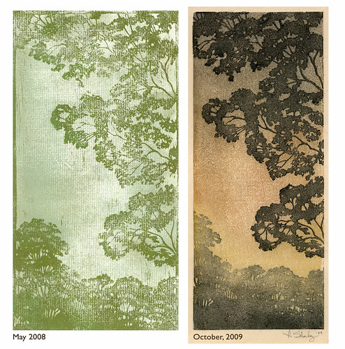
This is the first tree I carved. It was on EasyCut around the end of May in 2008. I remember being really disappointed when I tried to print it. The paper was all wrong. I think I printed on dry pastel paper. And I couldn't get good coverage. I was using Speedball Water Soluble ink applied with a brayer.

I reprinted it this week with Akua Kolor waterbased inks, brushed on, doing multiple impressions on the background and lino block, and printed onto the Japanese handmade paper Kitakata.

What a difference materials make! And a little more experience. I just wish, now that I've started printing from wood, that this was not carved out of that squishy stuff. It is pretty near impossible to get consistent registration with this stuff. It is just too soft. Sure, it is easy to carve, but there's just something about that baren on wood that feels better, and right.

Tuesday, October 6, 2009

Making Some Progress Part II

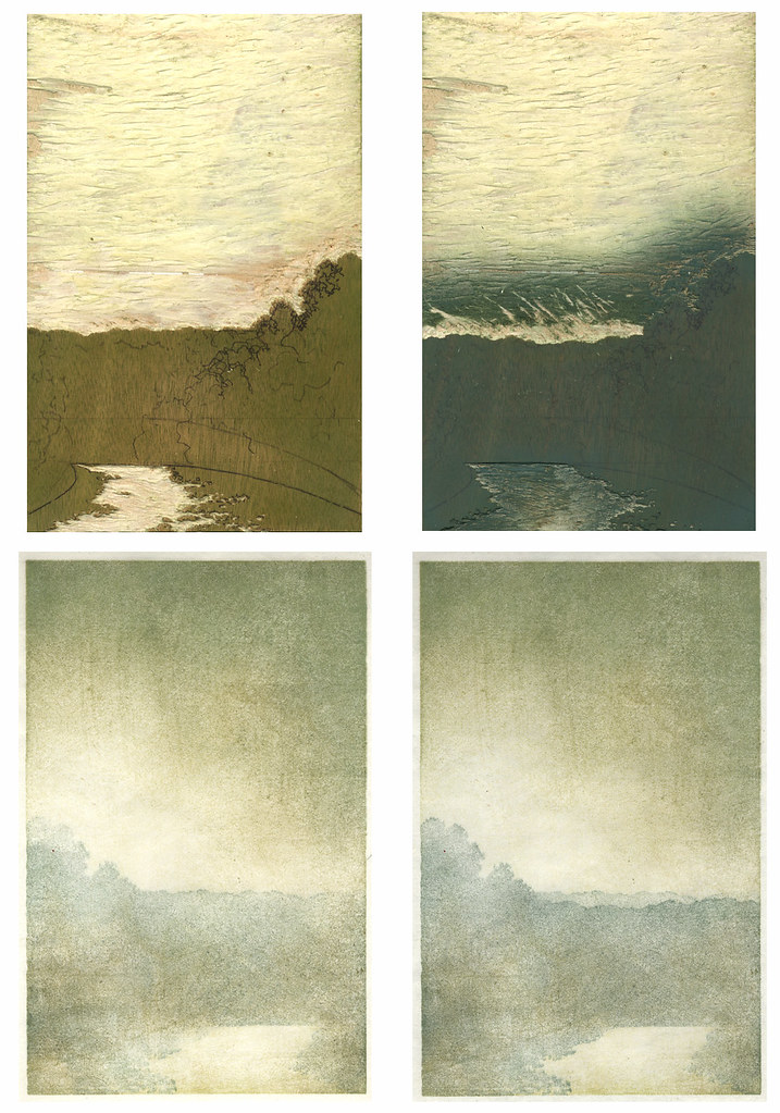
I was originally going to include these with my previous post, but once I got off the subject with color, I thought it might be better to start fresh. Here is my block after the first and second reduction, as well as the printed results. The print from the first reduction is a little different than the block. I ended up carving away more of the shadow in the road because the shape was looking a little awkward to me.

Now that I see them all printed, I can tell that I've made the some of the same mistakes I've made before. There's not going to be enough variation in the road to make the lightest area pop. I keep going too light with the first and sometimes second layer, over and over again. I'll see how it goes, but I'm kind of thinking I may need to carve another piece to add some color in that area later. I also need to watch my edges. There's a spot in the print I'm scanning right in the middle at the bottom where I've bumped into the edge of the shadow area, and there are a few similar spots on some of the others. I'm hoping that if I am very careful I can even those out in the next impression.

Overall, I'd say things are progressing nicely. I did lose one of my favorites when my baren slipped off the top of the trees, resulting in a couple of little specks right in the middle. I should just stop printing it now, instead of using it as a proof, because each time I see that it is going to remind me not to make that careless mistake again. On the other hand, the more I'm reminded, maybe the less likely I'll be to let it happen again.

Someone told me I'm too critical of myself when I write about artwork I've done. But then again, someone else once told me that when you stop being critical of yourself, you stop trying to do better.

Making Some Progress

So, the reduction print is going fairly well. I started out by making 2 backgrounds on inexpensive paper for proofs and 12 on paper I like. I'm using a mix of paper; creamy colored Kitakata, natural and white Sekishu, and finally 2 on Goyu, a paper I'm trying for the first time.

As usual, each one is different and some I like more than others. Basically, though, they all resemble this one with a light spot on the left and in the road. I'm using Akua Kolor water based inks and thinning them out with their Blending Medium. I started out the same way as with the monotype in my previous post. The first impression consisted of mainly Yellow Ochre brushed thinly over the entire block, wiped away gently in the areas that were to remain light, and then feathered out. The second impression was done with a Raw Umber/Burnt Sienna mixture applied to the darker areas and then feathered into the light area, and the third was some mixture Phalo Blue and who knows what else.

I have a little bit of a color problem. I'm a mixer. I mix in the palette tray I am using and I mix it on the block and sometimes I even mix it on the brush. And then when I print, I mix it up differently for the next one because I just want to see what it would look like if I added just a dab of something else. But it doesn't just apply to printing. It is habitual.

I go to paint a wall in my house and stare at paint chips for hours until I've picked out the perfect color. Once I'm home I do a test strip on the wall and realize it just isn't quite right, and then I start adding things to it. Anything. A little bit of acrylic or gouache from a tube. A little bit of the paint I added stuff to the last time I painted a wall. Then, all of a sudden, it is just the color I was looking for. The only real problem comes when I don't have enough and have to match it, which has happened more than once, but somehow I manage to do it again. Or start over.

Anyway, I had this revelation while I was printing these backgrounds and thinking about my mixing issues and controlling them by trying to make 12 prints that look the same as far as color, because I had tried to keep the first 2 or 3 the same. I remembered a conversation I had with an abstract painter at my office. I was showing him a few of my prints on the internet and describing the process involved. He commented on the fact that he could never plan ahead in the manner that one has to plan ahead to do a print, and that his artwork was more spontaneous. As the conversation progressed, we started talking about color, and he went on and on about color wheels and values and hues and names and knowing what was going to be used going in. He controls the color so the shape can be spontaneous.

After thinking about it for a while, I started thinking there wasn't much difference between my planning ahead and his. I just want to play with the color. I don't want to think about what it's name or number is or keep track of how I made it, I just want to mix it and layer it until it just feels right. I don't even think about it when I'm doing it, I'm just enjoying watching it happen. And maybe that's what printmaking is for me. I control the shape so the color can be spontaneous.

Thursday, October 1, 2009

The Road Into Town Part 2

So, the first step in my reduction print once I had the block carved was going to be printing out some backgrounds. The first two were on cheap scrap paper and the ink coverage was awful, and I was wavering on color. I thought I would use a piece of Sekishu on the third, and I liked the first impression. And the second impression. And so on and so on for about 15 impressions until I had made this. I'm going to call it a monotype study for a reduction print.

It helped me work out a couple of things. I need to reduce the size of the road by about 2/3. I tried it in Photoshop and the whole thing suddenly made more sense. I'm just glad to have discovered the proportional thing before I carved out that big chunk of light. I also need to work out what is going to happen on the lower right portion of the print, but I'm hoping once I reduce the road that may work itself out.

As for color, I'm still wavering so I'll just let that play out on its own.

One other thing I noticed is that I am getting some sharp clean edges printing on this birch plywood. And I like nice edges.

Wednesday, September 30, 2009

The Road Into Town


I don't know how many times over the past eight years that I've lived in my house I've pulled to the end of my street in the morning, stopped to turn right, and then wished I had a camera with me to take a picture of the view heading into downtown Bellbrook. I live at the top of a hill and downtown, with its one intersection, is at the bottom. It's different every morning, depending on the season and the time and the atmosphere. This morning was one of those mornings, but when I got home I pulled out my sketchbook and drew the view.

Suddenly, I have my next reduction print. It was not what I was planning, as I had already drawn out a beach on a piece of linoleum and cut out my paper. But I am feeling this one. The two lightest places, in the sky and in the road. The hills in the distance. The shadow on the road.

So I've decided that this will be the print I blog about start to finish. I've been meaning to do it for a while, but i get so caught up in the process that I don't want to stop to scan things in, or write about them. And I need to come up with a little postcard size visual documentary of what goes into these prints to help people understand as I try and sell them. Step No. 1 is the idea, and here it is.

Step No. 2 is already complete, as tonight I prepared my block. I'll be printing from a piece of birch faced plywood leftover from some panels I made for my built-in fridge. I like this stuff. It is relatively easy to carve and not too grainy, and it doesn't seem to get saturated with ink like my previous wood carving attempts with leftover pine stair treads.

I am definitely getting quicker and more efficient with this first step. Because I already had the 18 sheets of various papers ready to go for the other print I had in mind, I went with the same 7" x 11" size allowing for an inch of border surrounding the print. This is the registration system I've been using lately. I carve a right angle about an inch outside the image area to align the paper on the left and bottom edges.

It is getting to be a little late to move on to the next step tonight, which is likely the reason I am writing about it rather than doing it. I'll be drawing the sketch onto the block and then printing out the lightest ares, the sky and and road. I'm thinking it will take 2-3 impressions to get the gradient going, but that's one of those things that is subject to change once I actually start printing.

I have to add, especially after that previous post about reprinting, that starting something new holds a lot of promise. Who knows. This may be the One. The elusive print with which I am satisfied and happy with upon its completion.

Tuesday, September 29, 2009

Reprinting

So, I am in the process of reprinting some things, for a few different reasons.

I've committed to taking part in Dayton Visual Arts Center's holiday ARTtoBUY event, where they turn part of the gallery into a shop filled with member's artwork for two months. I had to fill out an inventory sheet listing my prints and how many of each print I had available, and I think it is probably a good idea to have that many of each one available.

With the reduction prints, that's an easy number, because once you are done, there are no more prints to be made. The only decision to be made is how many I want to hold back. For many of my early linocuts, however, I only printed one or two that were successful, and several of those were done with oil paint and I don't trust their longevity. Since I switched to the Akua Kolor inks, I've been meaning to redo them when I could find the time.

Also, now since I have an Etsy shop and have had my first few sales, suddenly having a little bit of an inventory seems like a good idea.

The problem I'm having, however, is that I'm finding out that I don't really like to reprint things that I've already printed all that much. It feels a little bit like work, instead of fun. And I keep blowing prints. Since I print multiple, brushed on impressions, I know I am going to lose a couple here and there to bad registration, but I am losing them for careless reasons, like the baren slipping down into carved out areas or off the side. It gets a little frustrating when you are down to the last impression.

I don't know, maybe I'm just not in the right frame of mind. After printing off wood, suddenly linoleum doesn't hold my attention like it once did. It doesn't feel the same. The ink slides off compared to the pressure you exert on wood, and how you can vary that pressure for different effects. And I've noticed that when compared to wood, linoleum has this strange magnetic power to attract every piece of dust or dog hair floating around. Not good during shedding season.

Or maybe it is just that I have too many ideas for new prints, and rehashing the past doesn't seem to be holding my attention or my interest.