Monday, March 30, 2009

Last Year's Grasses, Finished

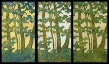
So, here's the finished print from my last post. I'm feeling so-so about it. I discovered and worked out some things with color and value which will help me out in the future, and then proceeded to totally overuse them. I also had some vision problems about half way through this one and once I missed a bunch of stray orange marks outside the edges and inside some of the prints, I kind of lost interest and just wanted to get it over with so I could move on with my life.

This is #5, my fifth reduction print. The first one was back in August, and I ended up disappointed with it after the amount of time I had put in. I tried again at the end of January and that print ended up in a juried show, giving me some encouragement to keep going with it, even though I was disappointed with it as well. I'm starting to wonder when I'm going to look at a finished print and say "I am happy with this." But yet I am totally compelled to keep going with it.

I am satisfied with the color on these. There are about twelve-fourteen of them, each on a different background. Using different backgrounds helped me come to the realization that I think I prefer that things have either a background of yellow ochre or one of the umbers. And I realized that's where it gets a little tricky, or easier, because once you have a background every color choice you make is dependent on what's below. You have to put some thought into it if you want to end up with mud, but you can acieve some great intensity if you do it right. I had been trying to make colors darker by making them darker until I had a totally "DUH" moment. This is transparent oil paint in thin layers. If I want to make red darker, don't add black to the red, print a thin layer of viridian. Rich darkness achieved, finally!

I also discovered that a very integral part of this whole printing process is being able to see what you are doing. Into my second impression of orange on the grass, after moving lights around and adding lights, I suddenly realized that the problems I was having with lighting were not due to the lighting. I couldn't see very well! A cheap pair of reading glasses confirmed it. My prescription had changed and I didn't have a clue that it had happened. Carving was much easier that night, but I didn't bother to put them on when I was printing and looking at my prints.

Big mistake. I missed stray printing marks all over the place, stray printing marks that I didn't even notice until a day later, when I took out my contacts and put on my glasses because my eyes were still bothering me when I worked on the computer. The thought had briefly crossed my mind that the problem could be the contacts, and not my eyes, but I had dismissed it. Once I took them out and put on my glasses I immediately remembered a comment that my 13-year-old son had made a few days earlier, about feeling dizzy. Even though our cases are completely different and his is marked, he had somehow switched them. I'm still seeing the eye doctor this week, because the reading glasses did make a difference, and I am also keeping my contacts in a different bathroom from here on out.

Now the question is what to do with all of these prints, that look ok for the most part, but have these little errors all over the place, especially outside the edges. Maybe I'm just too picky, and once I finally open an Etsy store people won't care about the little mistakes. Or maybe I'll just sell them all as proofs, or mat them to hide the edges, or, leave them stacked in that growing pile of artwork.

This whole thing is such a learning process, and with each print I've worked out problems I had in the previous one. And I'm totally in love with the process. But sooner or later I'm going to have to try and generate a little income from it, so it can start paying for itself.

Sunday, March 22, 2009

Last Night's Prints, This Morning


So, I've noticed that there are quite a few printmakers who post pictures of their prints laid out drying. I get it now. It's kind of satisfying to see them all lined up, after the care and attention that's been given to each one. These have been reduced twice and have had around 6-10 impressions apiece, and this is just the background.

I've also noticed that with most of the other reduction prints I've seen spread out like this, the prints are all the same. I think picking out a color combination and sticking with it for the whole edition is supposed to be part of the whole goal of this printmaking process. I don't know, but I don't think that's for me. I like random. I think when I look at mine, I like them all to be different, each special and unique in its own way.

The next step in this one will be a lot of carving, before I get back to printing again. And, if this next printing phase goes like my previous tries, I'll lose about five of these twelve little colorful gems to careless errors or poor color choices. But at least now I'll have this image to remember them by, and the promise they all once held.

Thursday, March 19, 2009

Printing With Oil Paints 1.0

So, since I first began hand pulling prints about a year ago, I knew right away that I liked carving the blocks. I also knew I had a lot to figure out about ink and paper, because I wasn't having much luck on that front. I tried dry paper, damp paper, wet paper, thin paper, thick paper, cheap paper, expensive paper, all without producing anything close to a satisfying result. And the same goes for the ink... Speedball water soluable ink out of the tube, and in various stages of thinned out using a variety of methods to get it on the block. Next I moved on to watercolors. I liked them better from the start, but I was still having problems with the pulling prints process.

Now I'm not saying that I haven't made some prints that I like, because I have. But there's always something kind of disappointing about them. The reduction prints seem to start off well, but by the end it seems like a struggle to find the enthusiasm to finish them because there's something I've done that I wish I hadn't. The paper was too wet for one impression and crinkled. The color was wrong on one impression and threw off the whole image. The registration was off. There was a big line outside the printed area where I missed wiping off excess color and didn't notice while printing. The list could go on and on.

But yet I've been compelled to go on. Half way through a print I'm already thinking about what's next and what I'll do differently to make it better. It's like an addiction, and I can't get enough of it, even though the printing process itself had become frustrating.

Then I tried using oil paints. My first attempt is to the left. I could get nice, intense, vibrant colors that were transparent, with texture. I could brush on the paint and thin it out and work with the paint on the block. And I could use dry paper!

My first reduction print with with the oils is below. The printing process that has been taking a week or more to end up with maybe a couple of decent prints took three days with little to no frustration. And I enjoyed the process. And I have the next one planned.

Box of Trouble

So, last week I opened this box that has been sitting in my laundry room for the past five months. I resisted the temptation to take a look even though I knew what was inside - my mother's oil paints. Opening it was like opening the kind of gift that keeps on giving, the kind that you know will bring you hour after hour of enjoyment.

And what eye candy. Partially used tubes of paint in a vast color range, from different manufacturers, of different ages. The smell of linseed oil and turpentine. My senses went into automatic overload as I was overcome with the urge to see how they felt. I had never tried painting with oils and couldn't wait to give it a go.

That first night, I cranked out a little 8" x 8" loose looking landscape, and I liked it. Quick, expressive and easy.


So the next night, I thought I would retry my most recent failed reduction print, one which will likely never get posted here or made public on flickr. That week of my life was wasted and I'll never get it back. But I digress. The first night went well, and I enjoyed it. I was painting from a picture I took last year. The second night I was anxious to get started, but then, suddenly after an hour or so, it got boring. Yeah, I can look at a picture and paint it. It wasn't doing much for me at all.

I realized painting is not quite my thing. At least not this kind of painting. If I was going to do something plein air I would definitely go with these, but not for any kind of artwork that you work on for a while. I just don't feel any connection.

The next night I printed with them. Joy.

Sunday, March 1, 2009

19th Annual Dayton Area Works On Paper

So today I went to the opening reception of the 19th Annual Dayton Area Works on Paper at the Rosewood Art Gallery. It was the first time I've ever had anything hanging at an art show, and the first time I've ever submitted anything to a juried show. I submitted two prints and the one pictured (or one that kind of resembles it) was accepted.

It's a good show. Lots of variety and plenty of strong artwork, a lot of it by well known Dayton artists. Around 250 pieces submitted with 55 being selected.

I'm not sure why mine was there. I guess it looked OK, but I'm kind of surprised it was chosen. Or maybe it's that I'm not sure why I chose it, because there are better ones in this edition. And I hate the way I matted it. It has nice clean edges and I cropped them because I don't like the leaf on the bottom left. I have to keep reminding myself that this stuff takes a lot of time, and after all, it's carved, and getting a gradient using layers of carving not exactly an easy process, so maybe I earned some points for that.

All in all, it was kind of anticlimactic. It was nice to see it there, but I didn't really like seeing it that much. A little uncomfortable. Maybe this stuff is better left in the growing pile of unfinished artwork until I make something I look at and think, "Wow. I'm happy with that."

Artist Site

So, a couple of months ago I bought back my starkeyart.com domain and I've just put up a new site over the weekend. It was kind of challenging, because I didn't want it to be about design, just about artwork I've done, so I tried to keep it simple. Check it out if you get a chance.