Sunday, August 11, 2013
WHAT???
Almost 2 years since I have made a blog post??? I have thought out a hundred of these things and yet they have not made it here. Time to do some catching up.
Sunday, September 11, 2011
9-10

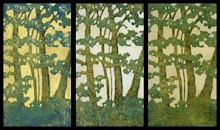
So I spent today making this woodblock reduction print. It's pretty surprising that I was able to start and finish an edition in one day, and equally surprising that I do a print that has much meaning other than being, well, trees. It was inspired by a conversation I had a few days ago with my teenage son that was stuck in my head and doing the print was a good opportunity to get it out. We were having a conversation about the tenth anniversary of 9-11, school related activities and what he remembered about it.
"It desensitized my entire generation. The America we know isn't invincible."
He went on to say something about growing up in a country where being attacked was a possibility. I have no idea what that is like. My generation didn't have such concerns or worries or images of burning towers stuck in our minds when we were in elementary school. It's not difficult to think of the impact the events of that day had on the lives of thousands of people, but it's hard for me to fathom the effect it had on a generation's view of the country and world they live in, and what it is like to grow up in that world.
This print is titled 9-10. I think it's about that beautiful, recognizable skyline and about the last day a country full of elementary school children went to bed with a different view of the world they grew up in.
9-10
reduction woodcut, edition of 20, 7" x 3.5"
Akua Kolor on various papers
Sunday, July 24, 2011
Receptions and Things

So, I was feeling pretty good about being the featured artist at this charming new cafe, Amicis. There's not all that much wall space and I have plenty of prints and framed prints and empty frames, and I have a week to decide what will go. I was feeling pretty good about it until I made this postcard this morning an sent out invites to a ton of people and started getting back responses.
Seeing the invitation on the internet has started one of those spiraling-out-of-control feelings that I need new prints. My head is filling up with thoughts of a couple new monotypes and reprinting a few blocks in different colors. I need to stop thinking and be happy with what I have, but as much as I try and talk myself out of it, I know I won't be sleeping much this week.
Monday, March 7, 2011
Big Trees
 So, this is part of a big block I spent a few weeks carving at the end of 2010 and beginning of 2011. It was slow going at times because of the detail, but I was really enjoying this 24" x 20" piece of Shina plywood so I tried not to keep track of the time spent carving it. I'm realizing that I don't have much to say about it except that I still haven't figured out exactly how it looks best printed. I've tried a few on monotype-ish blue background as well as a couple on a burnt sienna background. And there's something about the tree in the upper right hand corner I don't like, so that may change before I print again.
Anyway, one of them won an Award of Excellence at the annual Dayton Area Works on Paper. And there was this article in the Dayton Daily News where I gave some odd sounding quote about why I print trees. If you do read it, I didn't say a word about the condition of my hands after the carving, but I did show my calluses to a couple of people. Hell, I was proud of them....they made carving NOT hurt! So there's a paragraph about hurting my fingers and suffering for art and that kind of thing, which taught me that when you are an award winning artist you need to watch what you say about your art. (sarcasm)
Here it is.
 And the award winning version where I left out the awkward branches.
Wednesday, December 1, 2010
Black Ink, Fresh Art and Inspiration
 Where to begin with this one? Let's start with the week I spent making black and white prints for Visceral Gallery's Color Restrained show the last week of August, because that seems like the beginning of this story. These are the prints, made from one of my mix-n-match moku hanga experiments, previously printed in color. This was the first time I had tried printing in black and white since I first began my adventures in printmaking, and I quickly became enthralled with the possibilities and results. I mentioned how much I enjoyed it to Dayton Printmaker Co-Op founder and former printmaking professor Ray Must and he smiled and said, "Black can be the color." Profound and true. And thus began my month and a half of exploration into the wonderful color that is black.
Then jump ahead a couple of weeks. It was once again time for Dayton Visual Arts Center's Fresh Art, a plein air event. I set off into the woods, off to the top of Mount Saint John, armed with all my soft pastel supplies on a beautiful fall day at the Bergamo Center. I trekked around off the beaten path until I found the perfect spot surrounded by trees and I was ready to go with my colorful array of broken pastels, broken so I could fit more colors. As I prepared to get started I was suddenly overwhelmed by the light coming through the trees and shot off a little pencil sketch, unaware of its future significance.

Once again I started to draw the magnificent gnarly massive tree in front of me, but I became distracted by the shadows dancing across my paper as light flickered through the leaves around me. Suddenly, three hours later, I had this rather than some colorful landscape. Something that made several people ask, "It's cool, but what is it?" I think I titled it my typical bad title fashion something like Shadows On Mount Saint John.
The Mount Saint John titled artwork didn't end at the end of the day. A day or so later I looked at that pencil sketch I had done and decided I should try it as a monotype. After five or six small monotypes I decided I should try it as a larger monotype. After a half dozen of those I decided I should try it in differently proportioned monotypes, which was followed by some monotypes of trees, and finally, a 4 block woodcut of the original sketch which had evolved into a design and composition I was very happy with. Every day for almost 6 weeks, with every spare moment I had I made art, black and white art with the exception of the woodcut, inspired by those three hours spent on Mount Saint John.
So a few of the pieces ended up in a show at Bergamo to which I was hesitant about submitting, as it was a show about Fresh Art and the plein air experience and they had been made well after those three hours spent in the woods. The were, however, a direct result of those three hours. They were reviewed in The Dayton City Paper, which was cool, and I've sold a few of them at DVAC and on Etsy.
The best thing, though, was making the art, and being inspired and consumed with it, and those few hours spent in the woods could lead to such an output. And remembering for a brief second on Mount Saint John while enjoying the fall day and the flickering shadows, I had a thought I will never forget pass through my head.
If this was my job, I would be good at it.

Thursday, November 4, 2010
Published!
 So, there was this crazy week at the beginning of September where I had about seven art deadlines I decided I would attempt within a week. After it was over and I caught up on sleep, I wondered what the point was, and if it was worth it to enter juried shows and write proposals for shows and try to get grants. I'm still not sure, but I'm happy to say that my efforts thus far have been rewarded. My prints made it into the shows and I sold a couple of them, as well as the pastel on the left, whose framing in an early 19th century mirror and the weekend I spent doing it is worthy of its own post.
The big news, though, is that this pastel won an award in this year's Pastel 100 and will be in the March/April issue of the Pastel Journal. Exciting stuff, although I can't help wish that it was still mine.
Thursday, August 12, 2010
Waterless Litho Luv, AKA, Somebody Hide the Calligraphy Pens Please
 So, a few months ago I had about an hour to pop into a workshop at the Dayton Printmakers Co-Op by Sinclair printmaking professor Kevin Harris for a quick lesson on waterless lithography. For those unfamiliar with the process, it goes something like this... you draw on a grained aluminum litho plate, cover the drawing with a thin layer of silicone, wash off the drawing and voila, you are left with a plate which repels rubber based ink anywhere there is silicone. You can also use the process by transferring a Xerox copy to the plate with lacquer thinner or acetate and then going through the same steps. Sounds pretty simple, eh?
It's not that complicated of a process, but of course there are some variables and things that can go wrong and things you can spend a lot of time correcting. Otherwise it would be something different than printmaking. You are supposed to be able to draw with any water based media so I tried about everything I had around the house, from watercolor pencils to some mixture of Akua Kolor ink and modifiers of who knows what kind, to sharpies and gel pens, which are also supposed to work. I spent a lot of time drawing. Note to self: Always do a small test before investing a lot of time drawing! Needless to say, I wasted a few plates and drawings and hours, but I did get to enjoy the drawing part of it. And I got smart and started scanning in my drawings so in case I ruin the one on the plate I can still try the Xerox method, even though I'm resistant to using anything that is a "reproduction." I think I'm afraid that once I go down that road I'll start going through the thousands of photographs that live on this machine and start trying to print those instead of coming up with new things.
Anyway, I discovered that there's something about the way ink flows onto these aluminum plates from a calligraphy pen, those kind you dip into the ink, that's a little bit magical. There's something about the smoothness of it and the way it clings to the surface that's graceful and sexy and it's hard to resist. And it's perfect for drawing tree limbs. There's also a randomness to the prints that I really like. I keep ending up losing some of the fine detail in the silicone process, as this is one of the variables that it's difficult to get just right. You get it on a little to thick or too thin and then you can't wash away the drawing or you wash off too much. But in a way I like that. It gives a neat and tidy drawing a little edginess, or something like that, and the random stuff can happen with in the inking is also pretty appealing to me.
And I get to play with ink. I've been inking them up with a rubber based black VanSon ink and then applying Akua Kolor over the plate. It's a trial and error process, as it's difficult to get the Akua Kolor just the right consistency to adhere to the silicone...it naturally wants to bead up. Thin layers brushed on and feathered out very gently seem to work best. I can't get any of the softness I like about my woodcuts with the process, and believe me I've tried and failed, but there's something stark and graphic about the end product that I like. And wow, do I enjoy the drawing part.

Subscribe to:
Posts (Atom)
