So, it was a year ago, First Friday of November 2008, that I went to my very first First Friday. I had known about this First Friday thing since it's inception, where the galleries downtown are open late (and serve drinks), and had thought that it was something I'd like to attend but never really had the opportunity. That night, I just happened to be having beers with a friend from work and I suggested the gallery thing and we did it. And actually, life hasn't been the same since then.
I remember thinking and saying that I wanted to be one of the artists who's work was on display. I thought, for the first time, that I could do this thing. I could be an Artist. And I wanted to do it, and I shot for that goal.
Exactly one year later, I will be.
Dayton Visual Arts Center has this ArtToBuy event, where they turn part of the gallery into a shop during the holiday season. I'm one of the artists and I'll be selling prints. And...I'll be demonstrating that night, demonstrating hand pulled prints Moku Hanga style.
Wow. What a year. And I owe a big thanks to those whose encouragement and support helped me get here.
Sunday, October 25, 2009
Getting There
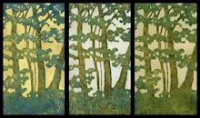
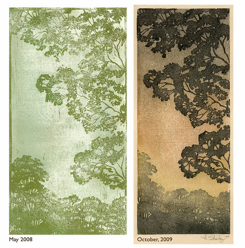 This is the first tree I carved. It was on EasyCut around the end of May in 2008. I remember being really disappointed when I tried to print it. The paper was all wrong. I think I printed on dry pastel paper. And I couldn't get good coverage. I was using Speedball Water Soluble ink applied with a brayer.
I reprinted it this week with Akua Kolor waterbased inks, brushed on, doing multiple impressions on the background and lino block, and printed onto the Japanese handmade paper Kitakata.
What a difference materials make! And a little more experience. I just wish, now that I've started printing from wood, that this was not carved out of that squishy stuff. It is pretty near impossible to get consistent registration with this stuff. It is just too soft. Sure, it is easy to carve, but there's just something about that baren on wood that feels better, and right.
Tuesday, October 6, 2009
Making Some Progress Part II
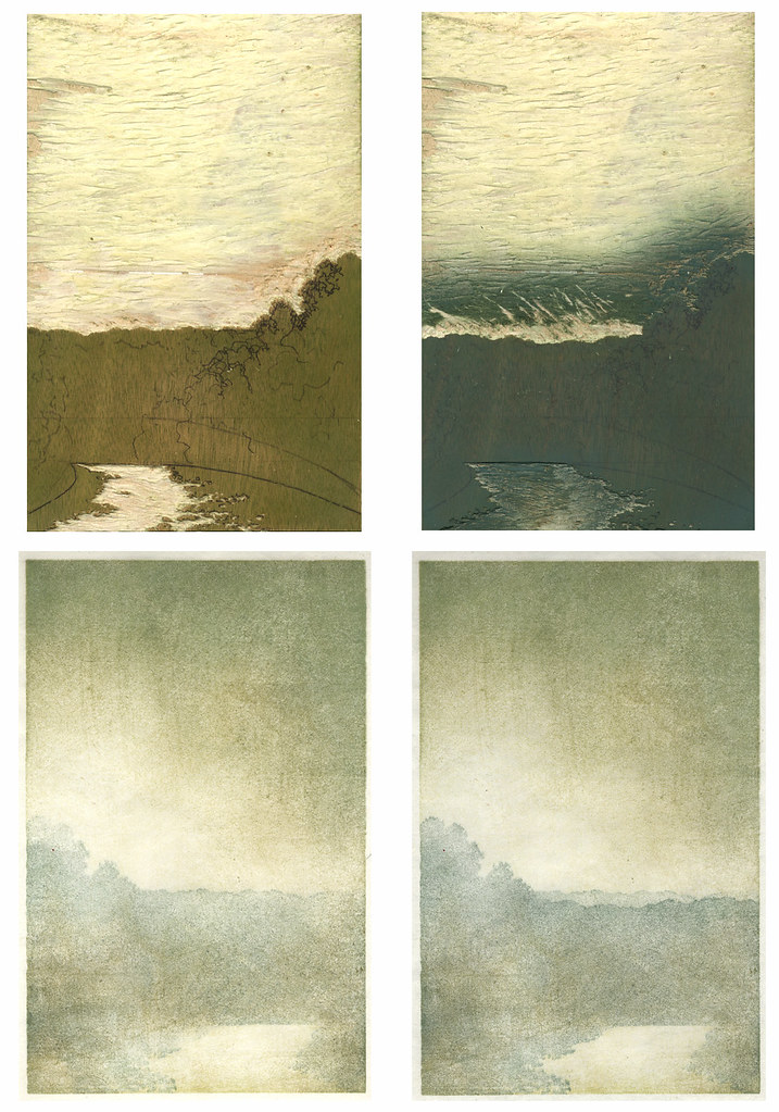 I was originally going to include these with my previous post, but once I got off the subject with color, I thought it might be better to start fresh. Here is my block after the first and second reduction, as well as the printed results. The print from the first reduction is a little different than the block. I ended up carving away more of the shadow in the road because the shape was looking a little awkward to me.
Now that I see them all printed, I can tell that I've made the some of the same mistakes I've made before. There's not going to be enough variation in the road to make the lightest area pop. I keep going too light with the first and sometimes second layer, over and over again. I'll see how it goes, but I'm kind of thinking I may need to carve another piece to add some color in that area later. I also need to watch my edges. There's a spot in the print I'm scanning right in the middle at the bottom where I've bumped into the edge of the shadow area, and there are a few similar spots on some of the others. I'm hoping that if I am very careful I can even those out in the next impression.
Overall, I'd say things are progressing nicely. I did lose one of my favorites when my baren slipped off the top of the trees, resulting in a couple of little specks right in the middle. I should just stop printing it now, instead of using it as a proof, because each time I see that it is going to remind me not to make that careless mistake again. On the other hand, the more I'm reminded, maybe the less likely I'll be to let it happen again.
Someone told me I'm too critical of myself when I write about artwork I've done. But then again, someone else once told me that when you stop being critical of yourself, you stop trying to do better.
Making Some Progress
 So, the reduction print is going fairly well. I started out by making 2 backgrounds on inexpensive paper for proofs and 12 on paper I like. I'm using a mix of paper; creamy colored Kitakata, natural and white Sekishu, and finally 2 on Goyu, a paper I'm trying for the first time.
As usual, each one is different and some I like more than others. Basically, though, they all resemble this one with a light spot on the left and in the road. I'm using Akua Kolor water based inks and thinning them out with their Blending Medium. I started out the same way as with the monotype in my previous post. The first impression consisted of mainly Yellow Ochre brushed thinly over the entire block, wiped away gently in the areas that were to remain light, and then feathered out. The second impression was done with a Raw Umber/Burnt Sienna mixture applied to the darker areas and then feathered into the light area, and the third was some mixture Phalo Blue and who knows what else.
I have a little bit of a color problem. I'm a mixer. I mix in the palette tray I am using and I mix it on the block and sometimes I even mix it on the brush. And then when I print, I mix it up differently for the next one because I just want to see what it would look like if I added just a dab of something else. But it doesn't just apply to printing. It is habitual.
I go to paint a wall in my house and stare at paint chips for hours until I've picked out the perfect color. Once I'm home I do a test strip on the wall and realize it just isn't quite right, and then I start adding things to it. Anything. A little bit of acrylic or gouache from a tube. A little bit of the paint I added stuff to the last time I painted a wall. Then, all of a sudden, it is just the color I was looking for. The only real problem comes when I don't have enough and have to match it, which has happened more than once, but somehow I manage to do it again. Or start over.
Anyway, I had this revelation while I was printing these backgrounds and thinking about my mixing issues and controlling them by trying to make 12 prints that look the same as far as color, because I had tried to keep the first 2 or 3 the same. I remembered a conversation I had with an abstract painter at my office. I was showing him a few of my prints on the internet and describing the process involved. He commented on the fact that he could never plan ahead in the manner that one has to plan ahead to do a print, and that his artwork was more spontaneous. As the conversation progressed, we started talking about color, and he went on and on about color wheels and values and hues and names and knowing what was going to be used going in. He controls the color so the shape can be spontaneous.
After thinking about it for a while, I started thinking there wasn't much difference between my planning ahead and his. I just want to play with the color. I don't want to think about what it's name or number is or keep track of how I made it, I just want to mix it and layer it until it just feels right. I don't even think about it when I'm doing it, I'm just enjoying watching it happen. And maybe that's what printmaking is for me. I control the shape so the color can be spontaneous.
Thursday, October 1, 2009
The Road Into Town Part 2
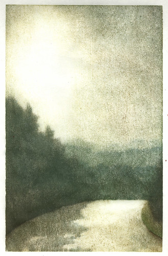 So, the first step in my reduction print once I had the block carved was going to be printing out some backgrounds. The first two were on cheap scrap paper and the ink coverage was awful, and I was wavering on color. I thought I would use a piece of Sekishu on the third, and I liked the first impression. And the second impression. And so on and so on for about 15 impressions until I had made this. I'm going to call it a monotype study for a reduction print.
It helped me work out a couple of things. I need to reduce the size of the road by about 2/3. I tried it in Photoshop and the whole thing suddenly made more sense. I'm just glad to have discovered the proportional thing before I carved out that big chunk of light. I also need to work out what is going to happen on the lower right portion of the print, but I'm hoping once I reduce the road that may work itself out.
As for color, I'm still wavering so I'll just let that play out on its own.
One other thing I noticed is that I am getting some sharp clean edges printing on this birch plywood. And I like nice edges.
Subscribe to:
Posts (Atom)